
Sketchplanations: You get what you measure
Picture this: A scientist pulls fish from the sea with a net. After examining his catches, he concludes there’s a minimum size of fish in the ocean. His data is clean, his methodology is sound, and his confidence is high.
He’s also completely wrong.
The holes in his net determined what he could measure. The smaller fish slipped through, invisible to his instruments. What you measure shapes what you see — and more critically, what you miss.
Here’s another example: During World War II, the U.S. military wanted to add armor to their planes. They analyzed returning aircraft and mapped every bullet hole — wings riddled with damage, fuselages full of holes. The obvious move? Reinforce those areas.
But statistician Abraham Wald saw what everyone else missed. The planes they were studying had survived. The bullet holes showed where a plane could take damage and still make it home. The planes that got shot in other spots? They never returned to be counted.
Wald’s recommendation: armor the parts with no bullet holes in the surviving planes. Because those were the fatal weak points — the military just couldn’t see them in their data.

These stories — the fishing net parable from astrophysicist Arthur Eddington (later emphasized by Richard Hamming and beautifully illustrated by Sketchplanations) and Wald’s survivorship bias insight — capture the same fundamental truth: your measurement instruments determine what you can see, and what remains invisible often matters more.
This is the challenge we face in engineering leadership today. We’re drowning in metrics — PR counts, velocity points, lines of code, commit frequency — but are we actually measuring what matters? Or are we just counting the fish that made it through our net while the crucial data slips past unseen?
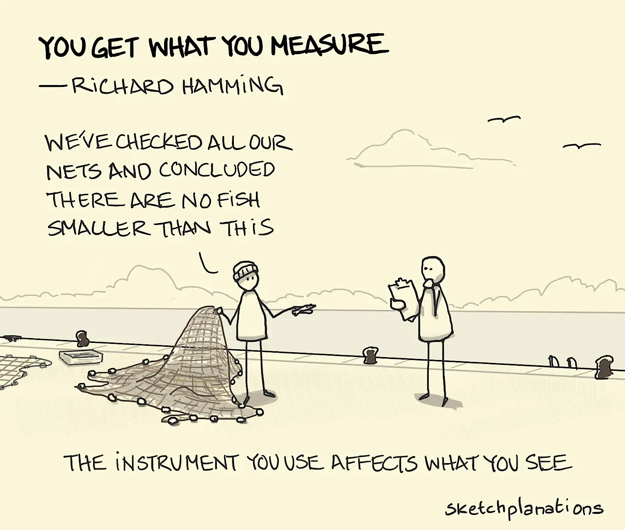
sketchplanations.com/you-get-what-you-measure
The Measurement Trap We Keep Walking Into
Here’s the thing: I’ve been in enough retros and planning sessions to know that when someone asks “how do we measure team efficiency?”, what they really want is a number. Something clean. Something you can put in a spreadsheet and trend over time. Something you can point to in an exec review and say “see, we’re getting better.”
And I get it. The pressure to quantify engineering productivity is real. Product wants delivery dates. Finance wants ROI on headcount. Leadership wants to know if that expensive AI coding tool subscription is actually moving the needle.
But here’s where it gets tricky. As Richard Hamming put it: “Accuracy of measurement tends to get confused with relevance of measurement.” Just because we can precisely count pull requests doesn’t mean that number tells us anything meaningful about value delivered to users.
This is Goodhart’s Law in action: when a measure becomes a target, it ceases to be a good measure. The moment you tell a team “we’re tracking PR count,” you’ve just incentivized them to split up their work into unnecessarily small chunks. The metric goes up. The actual productivity? That’s anyone’s guess.

I saw this play out in the most absurd way at a company in Cracow. They hired a contractor to build internal tooling and structured his compensation based on lines of code written. Seemed efficient, right? Easy to measure, clear incentive structure.
For a full year, this contractor worked solo on the project, churning out thousands of lines. His productivity metrics looked incredible. Management was thrilled with the progress reports.
Then they brought in an internal engineer to help scale the tooling. Within the first week, that engineer realized something was deeply wrong. The contractor hadn’t been building — he’d been copy-pasting. The same functions duplicated across dozens of files with minor variations. Zero abstraction, zero reusability, just raw volume.
That internal engineer spent the next several months doing nothing but deleting code and consolidating the mess. The codebase shrank dramatically. And guess what? The tooling actually started working better, became easier to maintain, and new features could finally be added without breaking everything.
The contractor had been financially incentivized to write more code, not better code. And he delivered exactly what the metric rewarded. Negative lines of code turned out to be the most valuable contribution to that project.
The PR Count Debate (And Why I’m Skeptical)
Let’s talk about pull requests, since that’s become the new darling metric in a lot of orgs. I’m going to be real here — I’m not a fan of using PR count as a primary productivity indicator, and I think we need to have an honest conversation about why.
The appeal is obvious: PRs are easy to count, they’re already in your tooling, and there’s a nice intuitive logic that more PRs = more work getting done. Some orgs have even adopted mantras like “a diff a day” to encourage consistent output.
But here’s the observation: PR count suffers from the same fundamental flaw as lines of code. It measures activity, not value. A developer could open twenty trivial PRs or one PR that solves a critical customer problem. The counts look identical. The impact is wildly different.
I’ve watched this play out firsthand. Teams start gaming the metric — artificially splitting work, avoiding complex refactors that don’t produce “enough” PRs, or worse, creating busywork just to hit their numbers. The metric becomes the goal, and the goal was never about the metric.
Does this mean PRs are useless? Absolutely not. PR cycle time, review patterns, and discussion quality can tell you a lot about team health and collaboration. But the raw count? That’s a vanity metric dressed up as productivity data.
Output vs Outcome: The Framework That Changes Everything
This is where the conversation needs to shift. We need to stop asking “how much did we ship?” and start asking “what changed because we shipped it?”
Output is what your team produces: features shipped, bugs fixed, code merged, tests written. It’s the tangible artifacts of engineering work.
Outcome is what happens because of that output: users can complete tasks faster, support tickets decrease, revenue increases, retention improves. It’s the behavioral change and business impact.
Here’s the catch: outputs don’t automatically create outcomes. I can ship a beautifully engineered feature that nobody uses. I can fix a hundred bugs that affected nobody. High output, zero outcome.
From a business perspective, this distinction is critical. Your CFO doesn’t care that you deployed 47 features last quarter. They care that customer churn decreased by 15%. Your users don’t celebrate your deployment frequency. They celebrate that the product finally does the thing they needed it to do.
From an engineering perspective, focusing on outcomes forces us to think differently about our work. It pushes us to:
- Validate before we build — Is this feature actually solving a real problem?
- Measure the right things — Did that refactor actually improve the codebase’s maintainability, or just make us feel good?
- Say no more often — If we can’t articulate the expected outcome, why are we doing this work?
The best teams I’ve worked with don’t just ask “what are we shipping?” They ask “what will be different when we’re done?” That shift in thinking changes everything.

DORA Metrics: The Balanced Approach
So if PR counts are out and we need to focus on outcomes, what should we actually measure?
Enter DORA metrics — the framework that’s become the industry standard for a reason. Developed by Google’s DevOps Research and Assessment team through years of research across thousands of organizations, DORA gives us four key metrics:
-
Deployment Frequency — How often you’re shipping code to production. Elite teams deploy multiple times per day.
-
Lead Time for Changes — Time from commit to production. Elite teams measure this in hours or days, not weeks.
-
Change Failure Rate — What percentage of deployments cause issues. Elite teams keep this under 15%.
-
Mean Time to Recovery (MTTR) — How fast you restore service after an incident. Elite teams recover in under an hour.
What makes DORA different? These metrics measure outcomes, not outputs. They tell you about your team’s ability to deliver value quickly, safely, and reliably. They’re also harder to game — you can’t fake your way to good DORA metrics without actually improving your processes.
The research backs this up: elite performers on DORA metrics are twice as likely to meet organizational performance goals. They deliver faster customer value and maintain higher developer satisfaction.
Here’s the important part: you need to measure all four together. A team with high deployment frequency but also high change failure rate isn’t actually performing well — they’re just moving fast and breaking things. DORA forces you to balance speed with stability.
One caveat from my experience: don’t immediately set targets. Monitor these metrics for at least a couple quarters before deciding what “good” looks like for your specific context. Remember Goodhart’s Law — the moment these become targets, teams will find ways to optimize for the metric rather than the underlying goal.

The AI Tools Paradox: Measuring What We Can’t See
Now let’s talk about the elephant in the room: AI coding tools. Cursor, Claude Code, Copilot — they’re everywhere, and everyone’s trying to figure out if they’re actually helping.
This is where measurement gets really interesting, and honestly, pretty counterintuitive.
Here’s what we know from recent research: there’s a massive perception gap between how productive developers feel with AI tools versus how productive they actually are. Developers using tools like Cursor and Claude consistently report feeling faster, more productive, more in flow.
But the data tells a different story. A rigorous study from mid-2025 found that experienced developers using AI tools actually took 19% longer to complete tasks, even though they predicted they’d be 24% faster. The developers felt faster, but the clock said otherwise.
What’s happening here? The friction is subtle but real:
- Time spent crafting prompts
- Time reviewing AI-generated suggestions
- Integration overhead with complex codebases
- Context switching between coding and AI interaction
Some orgs are seeing different results — companies like Webflow report 20% throughput increases for AI users. But here’s the key insight: the organizations that succeed with AI tools are the ones measuring both adoption and delivery performance.
They’re not just tracking “acceptance rate” or “lines of AI-generated code.” They’re watching DORA metrics, reviewing code quality, monitoring technical debt accumulation, and surveying developer experience. They’re building the full picture.

My Recommendation: A Practical Framework
Based on everything we’ve covered, here’s how I’d approach measurement at your company:
-
Start With DORA as Your Foundation — Track all four metrics together. Use them to establish your baseline and identify bottlenecks. Don’t set targets initially — just observe and understand your current state.
-
Layer in Outcome Metrics — For each major initiative or feature area, define clear outcome metrics tied to business goals: user engagement changes, support ticket volume shifts, error rate improvements, revenue impact (where applicable).
-
Add Qualitative Signals — Numbers alone won’t tell you everything. Regular team health checks, developer satisfaction surveys, and code review quality assessments give you the context metrics can’t capture.
-
For AI Tools: Measure the Whole System — If you’re adopting Cursor or Claude Code (or any AI coding assistant): track DORA metrics before and after adoption; monitor code quality and technical debt trends; survey developers on actual vs. perceived productivity; watch for changes in collaboration patterns; measure PR cycle time and review complexity. Don’t just look at tool-specific metrics like “suggestions accepted.” That’s an output. Ask: are we delivering value faster? Is code quality improving? Are developers less burned out?
-
Create Review Rituals — Have monthly or quarterly “metrics retrospectives” where you review your measurement approach itself; ask whether you’re optimizing for the wrong things; check if any metrics have become unhealthy targets; adjust what you measure based on what you learned.
-
Resist the Silver Bullet — No single metric will tell you everything. Not DORA. Not PR count. Not AI acceptance rates. The goal is a balanced portfolio of measurements that, together, give you a clear picture of team health and delivery capability.
The Bottom Line
We can’t avoid measurement — it’s how we know if we’re improving. But we can be thoughtful about what we measure and why.
The fishing net parable reminds us that our instruments shape what we see. Choose the wrong metrics, and you’ll miss the fish you’re actually trying to catch. Focus on outputs alone, and you’ll ship lots of features nobody needs. Let any single metric become a target, and watch Goodhart’s Law turn it into a distortion of what you’re trying to achieve.
The path forward isn’t to measure less — it’s to measure better. Use frameworks like DORA that capture outcomes, not just activity. Balance quantitative metrics with qualitative insights. Stay skeptical of metrics that feel too easy to game. And above all, keep asking: “does this measurement help us deliver more value, or does it just make us look busy?”
Because at the end of the day, that's what matters. Not how many PRs we merged or how many lines of code Claude wrote. But whether we built something that made our users' lives better. That's the measure that counts.